
Chiniche Engineering & Surveying
Brand Evolution Rooted in Family Legacy
Brand Strategy + Visual Identity
A strategic identity redesign that made the firm's strongest asset—its family name—immediately visible while preserving the visual traditions established by its founder.
Context
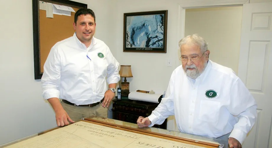
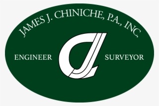
When Jason Chiniche assumed leadership of the engineering and surveying firm founded by his father, James J. Chiniche, he saw an opportunity to modernize its identity. The original mark combined two overlapping Js with a C, creating a symbol that was difficult to interpret from a distance. The firm's name appeared only as understated supporting text. Jason initially envisioned rebranding the firm as CES. Anne created and explored multiple concepts in that direction, but the abbreviation preserved the central problem: it did little to communicate the identity people already knew and trusted.
Approach
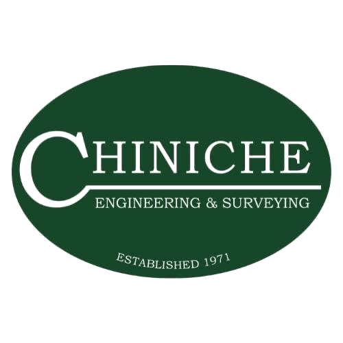
Anne developed an alternative concept with the Chiniche name prominently spelled out, based on the insight that the firm's strongest brand equity belonged to its family name. After consulting communications mentor Tish Williams, Anne presented the name-forward concept alongside the requested CES options. Jason invited his team and family to evaluate the directions, and the consensus favored placing the Chiniche name at the center of the identity. The selected direction was an evolution rather than a departure. Anne retained the familiar oval shape, traditional typography and established green-and-white color palette, but reorganized those elements around the Chiniche name. The result honored the company's history while making the brand clearer, more distinctive and easier to recognize.
Selected tactics
- Brand strategy and positioning of the family name as the firm's core equity
- Multiple CES abbreviation concepts, explored as requested
- Alternative name-forward identity concept
- Consultation with communications mentor Tish Williams
- Concept presentation and stakeholder review with team and family
- Final logo development retaining the oval form, typography and green-and-white palette
Identity, before and after
Impact
- The adopted logo modernized the firm while preserving the recognition built by the Chiniche family.
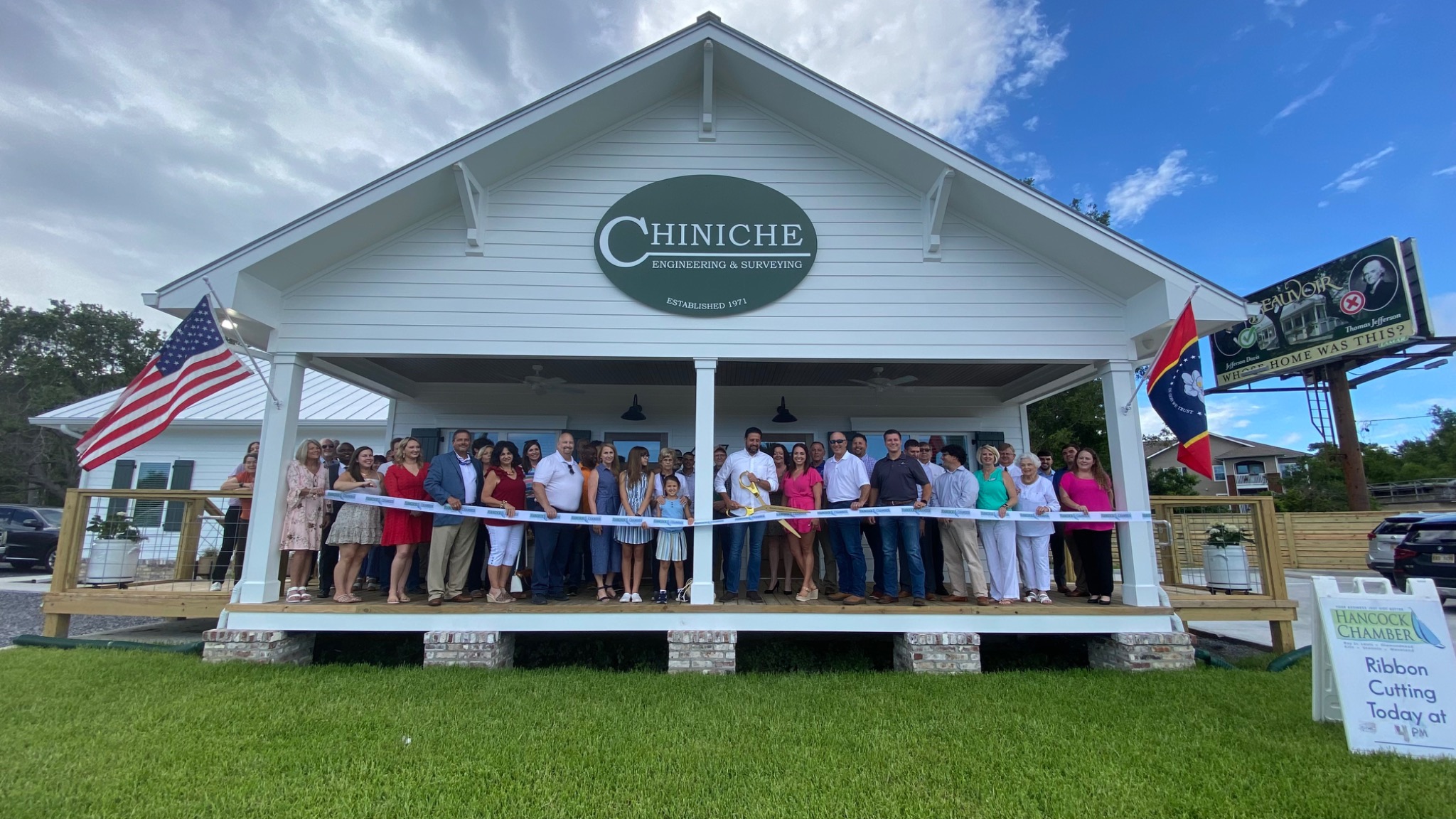
- The Chiniche team embraced the new identity and applied it exceptionally well across its Highway 90 building, fleet vehicles, printed materials, apparel and promotional items.
- Their consistent execution transformed the logo from a design asset into a highly visible brand — now one of the most recognizable business identities in Hancock County.
Credits
Anne's project scope was the logo redesign: brand strategy, concept development and creative direction.
All applications — building signage, vehicle graphics, print collateral, apparel and promotional items — were produced and implemented by the Chiniche Engineering & Surveying team.
Concept consultation: Tish Williams.
More work
Hancock Chamber of Commerce
Night of Stars
A chamber's signature awards night, treated as a brand platform rather than a program to be printed.
ViewAmerican Shipbuilding Suppliers Association
National Industry Communications
Communications built to serve members first — and to make a national supplier association legible to the industry it speaks for.
ViewBeau Rivage
ALLUSA
A patriotic cirque-style production promoted through the people it honored.
View